两列三列布局
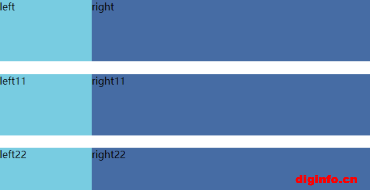
两列布局
1:浮动:左边的给宽高,右边的不设宽,用margin-left把左边的宽给留出来
2:相对绝对定位:给父级加position:relative,左边的给宽高并absolute,右边的不设宽,给高度并用margin把left的宽留出来
3:flex:给父级设flex,left给宽高,right设置flex为1,给高
效果图:
<!DOCTYPE html>
<html lang="en">
<head>
<meta charset="UTF-8">
<meta http-equiv="X-UA-Compatible" content="IE=edge">
<meta name="viewport" content="width=device-width, initial-scale=1.0">
<title>两列布局</title>
<style>
* {
margin: 0;
padding: 0;
}
/* 浮动:*/
.left {
width: 150px;
height: 100px;
background: rgb(87, 207, 228);
float: left;
}
.right {
height: 100px;
margin-left: 150px;
background: rgb(58, 109, 169);
}
/*相对绝对定位*/
#box {
position: relative;
margin-bottom: 20px;
}
.left1 {
position: absolute;
width: 150px;
height: 100px;
background: rgb(87, 207, 228);
}
.right1 {
height: 100px;
margin-left: 150px;
background: rgb(58, 109, 169);
}
/* flex*/
#box2 {
display: flex;
}
.left2 {
width: 150px;
height: 100px;
background: rgb(87, 207, 228);
}
.right2 {
flex: 1;
height: 100px;
background: rgb(58, 109, 169);
}
</style>
</head>
<body>
<!-- 浮动 -->
<div class="left">left</div>
<div class="right">right</div>
<br>
<!-- 相对绝对定位 -->
<div id="box">
<div class="left1">left11</div>
<div class="right1">right11</div>
</div>
<!-- flex -->
<div id="box2">
<div class="left2">left22</div>
<div class="right2">right22</div>
</div>
</body>
</html>
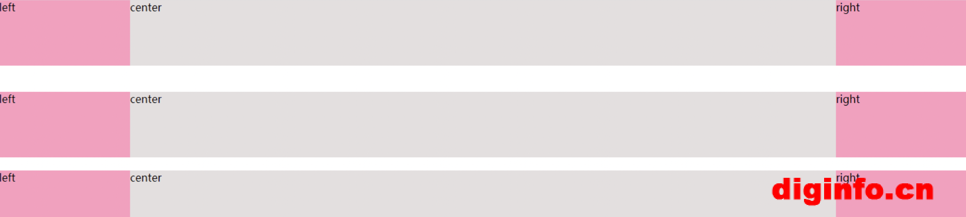
三列布局
1.浮动:写div时要把center放在最后面,left和right设置宽高并左右浮动,center给高度,用margin把左右两边的宽留出来就行了
2.绝对布局:写div时要把center放在最后面,left和right给宽高设置absolute,left的left值为0,right的right值为0。center给高度并用margin把left和right的宽留出来
3.flex:要给他们的父级盒子设置为flex,宽度为100%,左右部分都给宽高,center设置flex为1,给高
效果图:
<!DOCTYPE html>
<html lang="en">
<head>
<meta charset="UTF-8">
<meta http-equiv="X-UA-Compatible" content="IE=edge">
<meta name="viewport" content="width=device-width, initial-scale=1.0">
<title>三列布局</title>
<style>
* {
margin: 0;
padding: 0;
}
/* 浮动*/
.left {
width: 200px;
height: 100px;
background: rgb(253, 157, 191);
float: left;
}
.center {
height: 100px;
background: rgb(228, 223, 223);
margin-left: 200px;
margin-right: 200px;
}
.right {
width: 200px;
height: 100px;
background: rgb(253, 157, 191);
float: right;
}
/* 绝对布局*/
.second {
margin-top: 40px;
}
.left1 {
width: 200px;
height: 100px;
background: rgb(253, 157, 191);
position: absolute;
left: 0;
}
.center1 {
height: 100px;
background: rgb(228, 223, 223);
margin-left: 200px;
margin-right: 200px;
}
.right1 {
width: 200px;
height: 100px;
background: rgb(253, 157, 191);
position: absolute;
right: 0;
}
/* flex*/
.three {
width: 100%;
height: 100px;
display: flex;
margin-top: 20px;
}
.left2,
.right2 {
width: 200px;
height: 100px;
background: rgb(253, 157, 191);
}
.center2 {
/* flex属性是flex-grow,flex-shrink,flex-basis的简写,
默认值为0 1 auto。后两个属性可选。 */
flex: 1;
height: 100px;
background: rgb(228, 223, 223);
}
</style>
</head>
<body>
<div class="first">
<div class="left">left</div>
<div class="right">right</div>
<div class="center">center</div>
</div>
<div class="second">
<div class="left1">left</div>
<div class="right1">right</div>
<div class="center1">center</div>
</div>
<div class="three">
<div class="left2">left</div>
<div class="center2">center</div>
<div class="right2">right</div>
</div>
</body>
</html>

微信扫码加好友
全部评论